A guide to vendor selection and ongoing partnership to bridge the Martech gap.
Read more
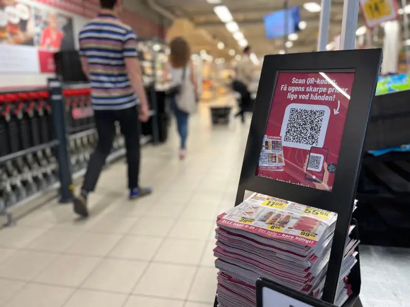
Re-thinking the analog mindset in retail
Dive into why adapting a digital-first approach is key for retailers.
Strategies for reducing print and its associated costs
This article explores a scientific study that tested a model for reducing print in collaboration with a retail chain in Italy.
Curation in E-commerce: Why retailers are struggling
The big challenges of curation in e-commerce: Get insights from experts on the art of product selection, customer engagement, and overcoming excess inventory.
Bridging the gap between print and online channels
What to consider when streamlining your catalog process for print and digital and how to makek sure you get the most out of both.
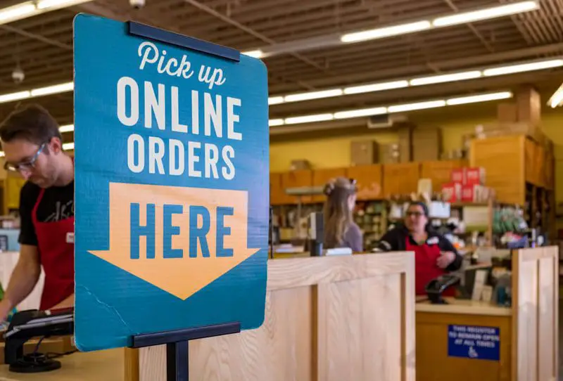
The profitability problem in grocery e-commerce
Online grocery shopping is here to stay. But to profit, retailers must implement technology that drives efficiency.
Why most retailers' digital transformations fail
Retailers need a successful digital transformation to regain customer loyalty. But most fail. Here's how to avoid their mistakes.
Can retailers afford to stop printing promotions?
The printed leaflet is still a key marketing tool, but has inflation and supply chain issues made the price too high?
Why product information could be a game changer
Don't depend on other websites to provide shoppers with product information. Instead, invest on your own content.
Your catalogs will be in good hands
We have over 20 year’s experience working with digital catalogs
Our dedicated team of experts are on hand to guide you to success