Digital catalog design: 10 things that make a catalog sell


What should a digital catalog look like on mobile?
Mobile first, whenever possible. That's where most of your readers are going to open it. Catalog links go out in emails, text messages, social posts and banners or in apps, and all of those get opened on a phone, one-handed, usually while the reader is doing something else.
Four things tend to break first when they do.
- Product density: we recommend sticking to a max of 6 offers on a catalog page that is also meant for mobile.
- Spreads: A layout composed across two pages will be broken up and look like two half-pages on a phone.
- Type size: text that reads comfortably on desktop might almost be unreadable at 390 pixels wide.
- Product CTAs: Anything a cursor can hit precisely, a thumb can miss, so the icon sizes need to be large enough.
Testing for all of this costs nothing at all. Open your last catalog on your own phone, use it the way a shopper would and try to buy something from it.
Which page do shoppers see first?
The front or the back? In print, it's often a coin flip.
In a digital catalog it's the first page, every time (unless you specifically don't want it and use anchor links), which means the back page loses the exposure it had in print.
That matters because the back page is usually where a lot of the best offers live. Retailers charge suppliers a premium for the first and last page precisely because a printed leaflet lands face-up or face-down at even odds, so both of those pages get seen roughly an equal amount.
But nobody clicks a link and arrives at the back cover.
Most readers don't work their way there either. Across our customers we typically see somewhere between 50 and 70% of a catalog actually viewed, which means the offers you charged the most for are the ones a good share of your readers never lay eyes on.
This is why it's important to not let the print file decide the page order (and if you're curious about that, I dive deeper into that here).
Give every page one obvious next step
A well placed call-to-action can make or break whether a browser becomes a customer. It invokes a clear action for readers and gives them a logical next step.
Luckily, this is quite easy to do. The first and most important thing you need to look for is the color contrast of the CTAs with the background and adding animation to make the online catalog CTAs stand out:
Another thing you can do is make the CTAs bigger. But be careful not to irritate the customer if there are already too many products on the page.
Keep in mind that you need to find the right balance in the online catalog.
Let shoppers buy without leaving the catalog
When making the leap from print to online catalogs, it's also extremely important to provide a way to check out.
It could be...
- Direct integration on your website and ecommerce
- Exporting all products in the online catalog basket to your webshop
- External links to your website
- Creating a wishlist
- Send to friends or family by email
- WhatsApp or Viber messaging
One of the best ways to turn visitors into customers in your digital catalogs is by making it super easy to shop directly from the catalog.
We are impatient online, and the more steps we have to take to buy, the less likely it is that we swing out our credit card.
Here, you can see how Oriflame fully integrated their online catalog with their website and ecommerce.
Show the product the way a shopper would pick it up
When it comes to online catalogs it's critical to catch the user’s attention. You can do this in different ways, but one of the best ways is to use images.
As the shopper can't pick up the product and see what it feels like, product images are key in selling online.
Make sure your online catalog images are large, high-resolution and highlight the key features of the product.
Just like Oriflame does:
Furniture retailer FOGIA really highlights the importance of making multiple images available in their online catalog.
On several pages, they also have an icon with "See more pictures". This opens up a carousel showing the product in more colors and from more angles. This makes it easier to imagine how the product looks in real life and showcases the different options.
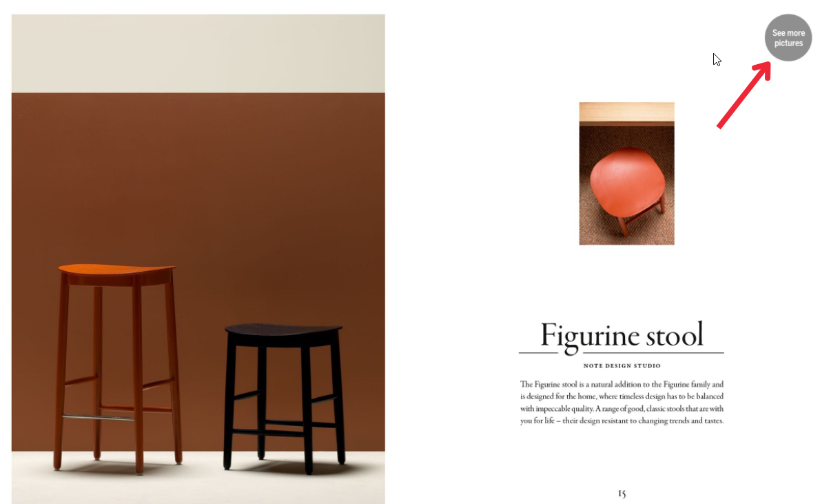
There's a limit to large and high-resolution, though. A catalog that's slow to load will lose people before the images get a chance to do any work, so quality and file size have to be balanced against each other. We put together five free tools for getting that balance right, including a DPI calculator.
Add video where it answers a question
You can't ignore videos in your marketing efforts. Viewers are between 64-85% more likely to purchase from you when they've seen one of your product videos (Kissmetrics).
So it's a good idea to invest in videos and add them to your online catalog.
Here, you can see how a video can be used to enhance the experience in the online catalog:
How many products should a page have?
Fewer than you'd put on a printed page. In print you're paying for every page you add, so you cram each one as full as it will go, but online the page costs you nothing and the real limit is how much attention a reader will give a single screen.
That print constraint is genuine, by the way, and it isn't going anywhere for the brands still mailing. Conforama is up at 40 to 43 editions a year.
Online, though, thirty products on one screen leaves each of them no room to sell and gives the reader no particular reason to stop on any of them. So spread them across more pages, because nobody's charging you for the paper.
Just don't overcorrect. Two products to a page turns browsing into work, and a reader who has to keep swiping to see your range will usually quit before they've seen much of it. Supermarket-style leaflets are the exception here, since readers scanning for a price expect that density and get frustrated without it.
If you're coming from print, the simplest place to start is to take your current page and remove about a third of what's on it.
Here, you can see how the display of few products in an online catalog gives them more space to shine and entice:
Write descriptions people actually read
Now that you have more space in your catalog, use it. Provide more value for your readers with product descriptions.
They help the reader understand the meaning behind the product or brand. In short, it makes the reader want to keep exploring.
A good example of this is consumer goods retailer COOP with their online spring catalog.
Product descriptions are accompanied with stories of the designers behind them, incorporating a little bit of personality and storytelling.

How do you know any of it worked?
Compare sessions that included a catalog visit against sessions that didn't. That's more of a tracking job than a design job, but it's the thing that turns the nine decisions above from opinions into questions you can actually answer.
Danish DIY chain 10-4 ran that comparison across more than 6 million webshop sessions in 2025, publishing a new digital leaflet every two weeks. The sessions that included a leaflet visit came back with 72.5% more time spent on the webshop, 87% more pages seen and a 5.1% higher basket value than the sessions without one.
That's 10-4's result on 10-4's traffic with 10-4's catalogs, so treat it as evidence that digital leaflets move behavior rather than as a benchmark or a forecast for your own. What does carry over is the method, so set up the with-and-without comparison before you redesign anything. Otherwise you'll end up with a new catalog and no way of knowing whether it made any difference.
Where to start
You don't need to work through all ten of these at once.
For most brands the two cheapest wins are deciding where the best offer sits and sorting out what happens on a phone, and you can fix both inside a single campaign and still see it in the numbers afterwards.
The feed question is the one that changes the other nine, though, so it's worth answering early even if the answer turns out to be "not this year."
Want the full overview? Check out Digital catalogs: the ultimate guide.
Frequently asked questions
Do you need a PDF to make a digital catalog?
No.
A digital catalog can be built straight from a product feed with no PDF involved at all, where you design a template once and the feed supplies the products, prices and images.
The PDF route still works and plenty of retailers use it, but it isn't a requirement any more.
How many products should a digital catalog page have?
Fewer than you'd fit on a printed page.
Page count is free online, so products that were fighting each other for space in print can be spread across more pages instead.
Supermarket-style leaflets are the exception, since readers scanning for prices expect the density.
What makes a digital catalog convert?
Mostly three things: a clear next step on every page, a way to buy without leaving the catalog, and the best offers placed where readers actually land rather than where the print file happened to put them.
Designing for a phone first tends to do more for conversion than any single feature does.
How long does it take to design a digital catalog?
The template is where the work sits.
iPaper offers standard templates that you can design to your liking.
Once that exists, a feed-built catalog is mostly a matter of picking the products and publishing, which is how Conforama Switzerland gets theirs out: fill a sheet with SKUs, upload it, make a few tweaks and publish.
Should a digital catalog replace the printed one?
For most retailers, no. Conforama Switzerland mails 40 to 43 printed editions a year alongside their digital catalogs, and Bilka uses digital for campaigns that were never going to justify a print run on their own.
Digital-first with print alongside is a far more common shape than digital instead of print.
Continue Reading
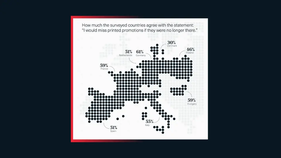
How would shoppers react to the death of print?
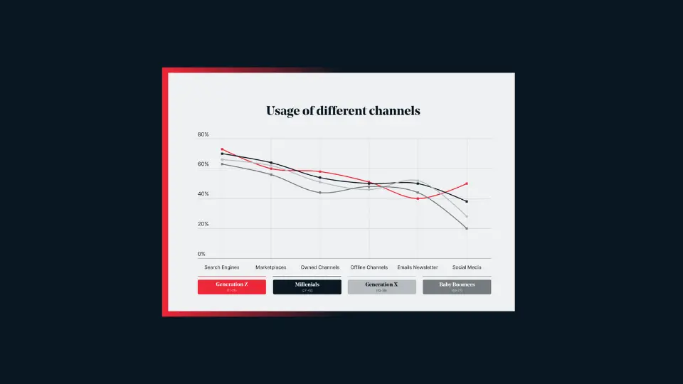
How different generations interact with catalogs

Why most retailers' digital transformations fail
Your catalogs will be in good hands
- We have over 20 year’s experience working with digital catalogs
- Our dedicated team of experts are on hand to guide you to success